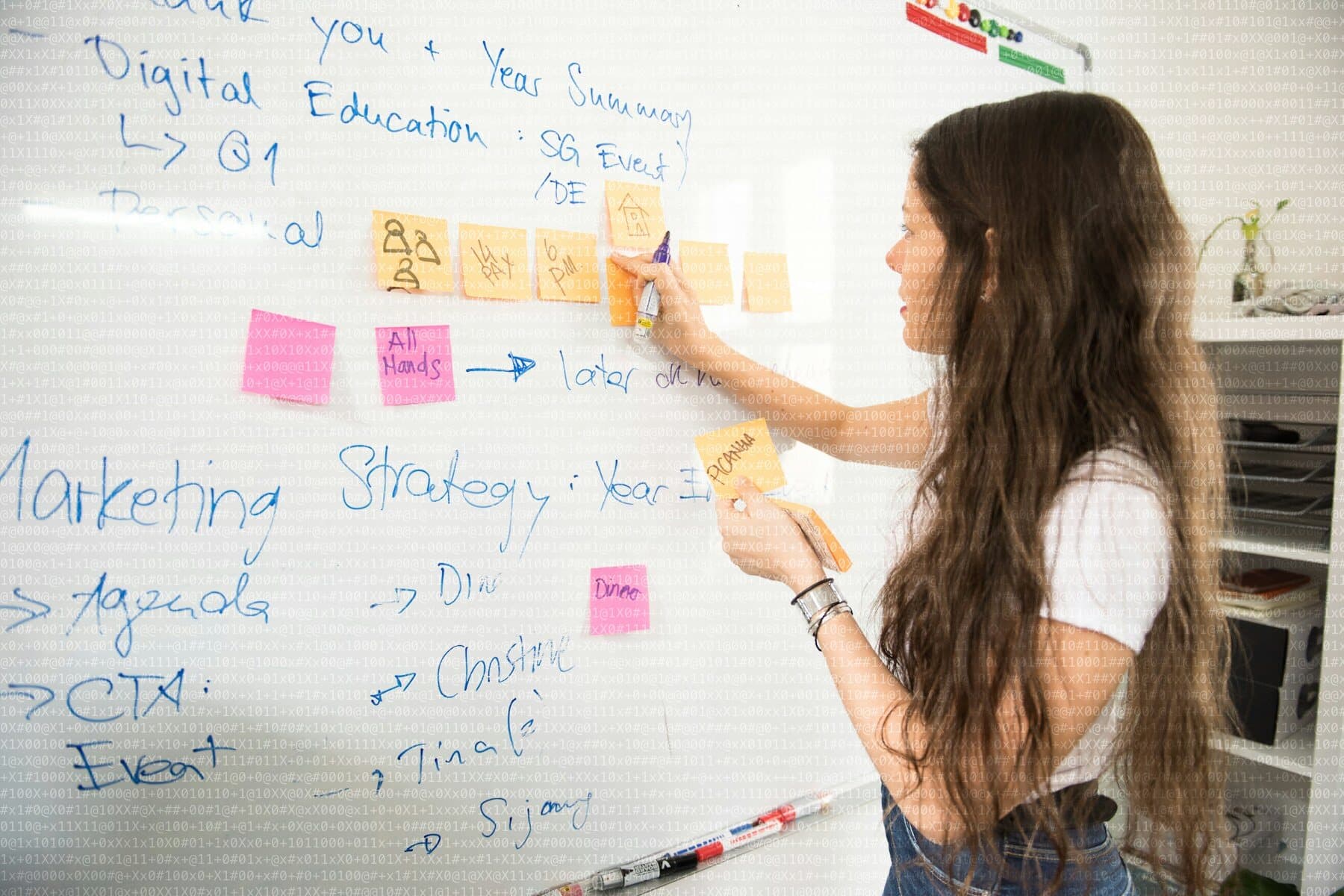
It is common to start a website with aesthetics: a beautiful mockup with filler sentences that will “be replaced later”. The problem is that real copy never measures the same as filler. When it arrives, the headline takes three lines, the button looks out of proportion and a design that seemed finished has to be redone.
Why the copy comes first
- Copy decides hierarchy: what is said first, what deserves prominence and what is surplus.
- With a clear message, design becomes a simpler decision: you design for what must be told, not to fill gaps.
- Copy changes after design are the ones that delay and cost the most.
How to do it without being a writer
- For each page, write one sentence saying what someone should understand on arrival.
- List the proof points that back that sentence: track record, cases, real figures, training.
- Draft it in your own words, as if explaining it to a client in a meeting.
- Cut: remove every sentence that does not answer a question someone would ask.
An imperfect but real draft is worth more than a perfect design over invented text. It can be polished later with an editor, but the content and structure will be on the table from the start.
An example with a services page
Take the “What we do” page of a consultancy. In the mock-up with filler there is a one-line headline, three cards with short titles and a two-line paragraph under each. It looks clean. When the real copy arrives, the headline has to explain who the service is for and takes three lines; each card needs four sentences to avoid staying abstract; and a fourth service line appears that nobody had foreseen. The tidy mock-up stops working.
Had the content existed first, the design would have started from another question: not “how does this fit into three cards?” but “what is the best way to present four services with this much detail?”. Perhaps a vertical list, perhaps one page per service. That decision changes the whole structure, and taking it late is expensive.
What a text for a website needs to contain
- A headline that informs instead of decorating: what it is, who for and what changes.
- A first paragraph that makes the essentials clear without forcing the reader to continue to understand.
- Subheadings that let someone skim the page and still follow the argument.
- Short, concrete sentences, with verbs and with real data when it exists.
- A close that says what to do next.
When writing feels hard
Many people who know their craft very well freeze when they write about it. A simple trick is to say it out loud: record yourself explaining the service as you would to a new client and transcribe it afterwards. The result will not be final copy, but it will have the order and natural words that a desk draft rarely achieves. From there, editing is far easier than writing from a blank page.
Another help is to look at the real questions you receive. If the same doubt arrives every week by email or phone, that question deserves a sentence on the website. The copy that works best is usually an anticipated answer to what people already ask.
Design organizes a message. Without a message, it only organizes gaps.
A sensible order of work
First the goal of each page, then draft copy, then structure and hierarchy, and finally visual design. It is the order we follow at Ingenia, and the main reason projects reach the design phase with fewer surprises.